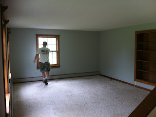
The property at the new house is pretty much to die for. It was the number one selling feature for us. The interior of the house? Not so much. It has great bones, solidly constructed, and lots of potential. But it's current cosmetic state is pretty nasty. Hubby and I spent all of last Monday and Tuesday tearing out every single square inch of seriously stinky carpeting. And I've been going there to paint for a few hours each evening after hubby gets home from work. To be perfectly honest it really doesn't look like we've accomplished much at all, which is a little discouraging right now, but it certainly smells better in there now, which is a pretty major feat. So this is the (slightly blurry iphone-pic) tour of the before state of the house...
1st Floor:
Kitchen:
Living Room:
Entry:
Master Bedroom:
Master bathroom (with some seriously epic pink plush carpeting. GROSS!)
Half Bath (this is actually my most dreaded room to tackle, even though it's the smallest. Not only was it the location of the previous owners litter box, but it's feline occupants apparently chose not to actually use the litter box. So it's a pretty stinky place, AND it's completely wallpapered. I'm not opposed to wallpaper, but this stuff isn't in spectacular condition, and I'm going to end up taking it down on principle of completely eradicating any lingering smells in the room):
2nd Floor (in much better condition than the 1st floor. After taking out the carpeting the other day, there's zero yuckiness up there anymore, and needs pretty minimal cosmetic stuff):
Upstairs Hallway:
Bathroom:
The Kid's Bedroom:
(that nook in the corner is the perfect spot for a sweet loft bed)
The Baby's Room:
More pics coming soon of the mess progress we've made so far.
Thanks for stopping by,
~Lindsey


lots of potential. I like. the kitchen looks out dated (red counter tops when were those ever in?) the kitchen looks very dark, may I suggest yellow. seriously who puts carpet in a bathroom and pink, wow! one thing I think we did backwards with our house is we painted cool colors in the rooms on the north side of our house and warm colors in the rooms on the south side. my advice it to the opposite of what we did. do yellows and reds in the north facing rooms and blues and greens in the south facing rooms. ~James
ReplyDeleteugh, don't even get me started on the red counter tops...
ReplyDelete